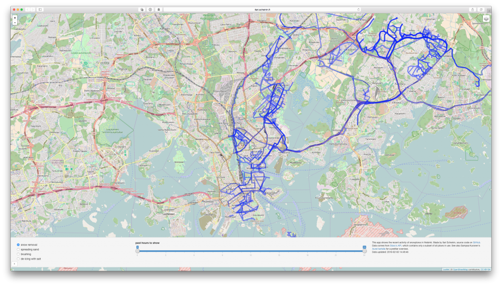
As part of the Helsinki Region Infoshare initiative, the city of Helsinki provides an API that shows the locations, routes, and activities of snowplows that are operated by its service provider Stara.
Using that API, Sampsa Kuronen created Aurat kartalla, which is a beautiful visualization of the real-time data. It allows you to specify a time interval, and shows different activities (snow removal, spreading sand, de-icing with salt, etc) with different colors.
I decided to try my own version with shiny, for a couple of reasons:
- In addition to identifying different activities, the API also includes a flag specifying “bicycle and pedestrian lanes”. Aurat kartalla always shows them with the same color, therefore not distinguishing between e.g. spreading sand and de-icing with salt. Although I personally don’t really mind that much, for some cyclists this is important information. Many have suffered flat tires because of the sand, and many feel that the salt rusts their bikes.
- Outside bicycle and pedestrian lanes, Aurat kartalla does show the different activities with different colors. But when there are multiple activities performed on the same route, it can be difficult to tell them apart.
- I had never created a shiny app that polls an external API and automatically updates its data, so it was simply an interesting experiment.
Here are links to the resulting shiny app and its source code on GitHub.
As my goal was to provide granular control to really check what activities had been performed along a specific route, at first I included a separate setting to distinguish between streets and bicycle/pedestrian lanes. However, after looking at the results on a couple of snowy days, I noticed that this flag wasn’t really that reliable. Exact same routes were plowed both with and without it.
I can think of two possible explanations. The first one is that the flag really just specifies the equipment used, and some plows are marked for bicycle/pedestrian lanes, while others are not. And that in reality, both can also operate outside these target routes. The second one is that the presence of the flag relies on the plow driver explicitly specifying when they are plowing a bicycle/pedestrian lane, and that this is simply often forgotten (as, to be honest, I would expect to happen in reality).
Therefore, I removed the separation between streets and bicycle/pedestrian lanes, and instead show both at the same time. But the main point is still to be able to unambiguously distinguish between the different activities that have been performed. However, this goal suffers a bit from the fact that the API doesn’t actually contain all of the plows in use, so there is no way to tell for sure whether something has not been performed.
Nevertheless, it was a fun experiment. And in any case, I think Aurat kartalla provides a more beautiful overall visualization of the same data, and with better performance.
