Ranking NHL’s best shooters – 2018 update

Last year, I published an analysis that ranks NHL’s best shooters with Bayesian multilevel modeling. Now that the 2017–2018 regular season is over, I have repeated the analysis with an additional year’s worth of statistics (it starts from season 1967–1968). Some highlights are shown below, and the full results table is available here.

I’ll start with a brief recap of the methodology. More details are available in the original blog post.

There are multiple ways to model players’ shooting ability. The simplest is to use the shooting percentage, which is the number of goals scored divided by the number of shots on goal. The metric is simple to define and straightforward to use, but it has two shortcomings.

The first shortcoming is that while it works well for players with a large number shots of goal, there’s more room for random chance for players with few shots. For this reason, the official career shooting percentage leaderboard only includes players with at least 800 shots. What if one wants to evaluate the shot of a young player who has only played for a couple of seasons?

The second point is not as clear of a shortcoming, but many have argued that the gameplay and level of goaltending have changed over the years. As a result, so has the difficulty of scoring goals, and this change is not reflected in shooting percentages of players from different eras.

To take these two issues into account, I have analyzed shooting percentages with Bayesian multilevel modeling. As always with modeling, there are assumptions that are simplifications of reality. The most important one here is the assumption that each player has an innate level of skill, or shooting ability, that does not change throughout their careers. While this is naturally not exactly realistic, it gives us a nice metric that can be used to rank players. And since players’ careers typically span multiple seasons, it also allows us accommodate scoring difficulty not being constant between seasons.

If you’re interesting in more details, please read the original blog post. It also contains full R and Stan code to perform the analysis, and some plots to evaluate its performance.

Results

After updating the model with data from season 2017–2018, here are the overall top 10 shooters. Any changes in ranking from last year are highlighted with arrows and color.

player position career shots goals raw model
1 Alex Tanguay forward 1999–2016 1,525 283 18.56% 19.93%
2 Craig Simpson forward 1985–1995 1,044 247 23.66% 19.85%
3 ↑ 1 Andrew Brunette forward 1995–2012 1,516 268 17.68% 18.84%
4 ↓ 1 Steven Stamkos forward 2008–current 2,088 348 16.67% 18.81%
5 Sergei Makarov forward 1989–1997 610 134 21.97% 18.64%
6 John Bucyk forward 1967–1978 1,723 329 19.09% 18.38%
7 Mark Parrish forward 1998–2011 1,247 216 17.32% 18.14%
8 Charlie Simmer forward 1974–1988 1,531 342 22.34% 18.09%
9 ↑ 48 Patrik Laine forward 2016–current 445 80 17.98% 18.06%
10 ↑ 7 Paul Byron forward 2010–current 388 70 18.04% 17.96%

As the most interesting changes from last year are for active players, here is also their top 10.

player position career shots goals raw model
1 Steven Stamkos forward 2008–current 2,088 348 16.67% 18.81%
2 ↑ 10 Patrik Laine forward 2016–current 445 80 17.98% 18.06%
3 ↓ 1 Paul Byron forward 2010–current 388 70 18.04% 17.96%
4 ↓ 1 Brad Marchand forward 2009–current 1,426 226 15.85% 17.77%
5 ↓ 1 Adam Henrique forward 2010–current 1,068 166 15.54% 17.20%
6 ↑ 2 Mark Stone forward 2012–current 613 95 15.50% 16.55%
7 ↑ 4 Sean Monahan forward 2013–current 929 138 14.85% 16.42%
8 ↑ 44 Auston Matthews forward 2016–current 466 74 15.88% 16.42%
9 ↓ 4 Sidney Crosby forward 2005–current 2,843 411 14.46% 16.30%
10 ↑ 8 Mark Scheifele forward 2011–current 760 113 14.87% 16.24%

The full results table with 5,573 players is available here.

Posted in R, sports | Comments Off on Ranking NHL’s best shooters – 2018 update

Ranking NHL’s best shooters with Bayesian multilevel modeling

Update April 12, 2018: This post is from spring 2017, so the results reflect statistics up to season 2016–2017. I have now re-run the analysis including data from season 2017–2018, and updated results are available here. Methodology is unchanged, so everything below is still an accurate description of how the analysis was performed.

In this post I will look at the question of who have been the best shooters in the NHL. The metric I will use is the shooting percentage, which is the number of goals scored divided by the number of shots on goal. To deal with two issues that will be explained in the next section, I will use a technique called Bayesian multilevel modeling. If that sounds complicated, fear not; it works kind of the same way as human intuition.

After Jake Guentzel scored his first NHL career goal during his first shift in his first game with his first shot, his shooting percentage was 100%. But no reasonable human being would say based on that alone that he was the best shooter of all times with that flawless record. Instead, to evaluate a new player, one tends to start with a vague assumption that their shooting ability is probably somewhat average, but can also be higher or lower. Then, as more and more evidence builds up, that assumption is updated, which leads to a more and more precise picture. This is essentially what “Bayesian modeling” means; start with a prior expectation and update it with the data you have.

There are many ways we can come up with that prior expectation. It could be the average shooting percentage of all players in the league, or defined more narrowly. Depending on the situation, we could for example look only at players who shoot from the right. Or players who are first-round draft picks. Or use the information we have on player position, and assess forwards and defencemen separately. After all, on average forwards do score more goals and in general shoot from much closer to the opponent’s net than defencemen. Here, the use of such a hierarchy, players grouped according to their position, is the “multilevel modeling” part.

When these two are put together, what Bayesian multilevel modeling means for this post is that I will use historical player statistics to estimate average performance separately for forwards and defencemen, and use this average as the starting point to evaluate each individual player. The more evidence there is for any given player, the further away we are ready to move from the average.

This post contains all the code needed to perform the analysis with R and Stan, but the code sections can be freely skipped over if one is not interested in them. Impatient readers can also skip directly to the results section, or just look at the full result table.

Data

Our data consists of the number of goals scored and shots on goal for each player for each regular season. NHL started to count shots on goal for season 1967–1968, so our data spans from that season to the just finished one 2016–2017. Here’s an excerpt of the first ten data rows. 1

player position season shots goals
1 Antti Aalto forward 1997-1998 1 0
2 Antti Aalto forward 1998-1999 61 3
3 Antti Aalto forward 1999-2000 102 7
4 Antti Aalto forward 2000-2001 18 1
5 Spencer Abbott forward 2013-2014 2 0
6 Spencer Abbott forward 2016-2017 1 0
7 Justin Abdelkader forward 2007-2008 6 0
8 Justin Abdelkader forward 2008-2009 2 0
9 Justin Abdelkader forward 2009-2010 79 3
10 Justin Abdelkader forward 2010-2011 129 7

We can aggregate this by player to get raw career shooting percentages.

player position career shots goals raw
1 Antti Aalto forward 1997–2001 182 11 6.04%
2 Spencer Abbott forward 2013– 3 0 0.00%
3 Justin Abdelkader forward 2007– 964 85 8.82%
4 Pontus Aberg forward 2016– 12 1 8.33%
5 Dennis Abgrall forward 1975–1976 9 0 0.00%
6 Ramzi Abid forward 2002–2007 112 14 12.50%
7 Thommy Abrahamsson defenceman 1980–1981 66 6 9.09%
8 Noel Acciari forward 2015– 33 0 0.00%
9 Doug Acomb forward 1969–1970 0 0
10 Keith Acton forward 1979–1994 1,690 226 13.37%

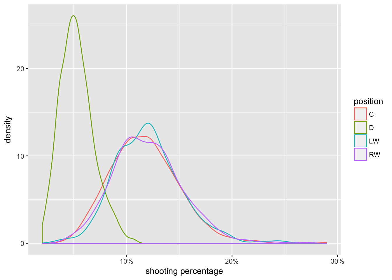
To get an idea of common values for raw career shooting percentage, we make a density plot and separate between forwards and defencemen.

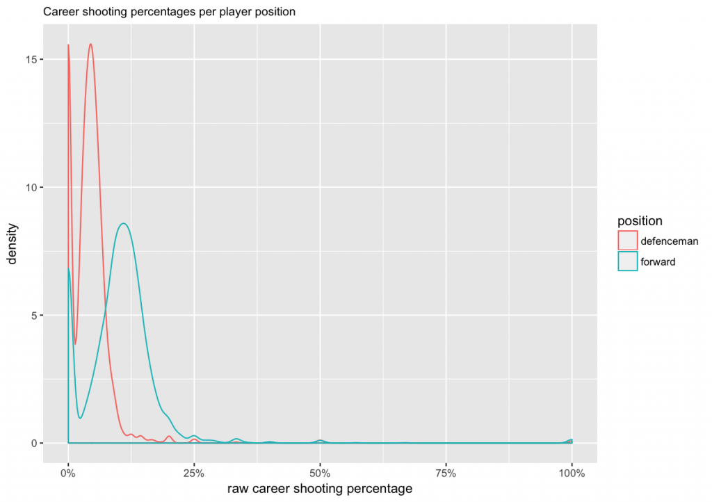
From the plot we can see that:
1. Defencemen tend to have lower shooting percentages than forwards (averages of about 4.5% and 11%).
2. There are big peaks at zero, which represent players who have never scored a goal (and who might also have a very small number of shots on goal).
3. There are also small peaks at 100%, 50%, 33%, etc, which represent players who have a small number of shots on goal, but who got lucky and scored.

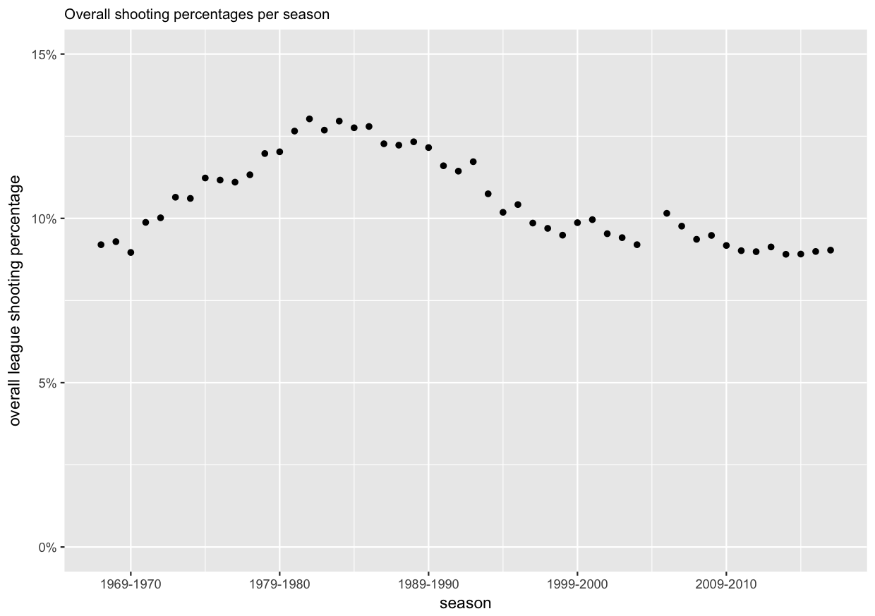
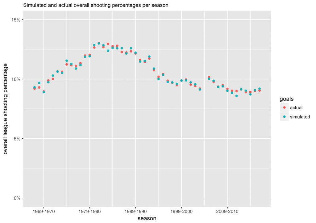
Points 2. and 3. above are the first reason why we use the modeling approach. It will give us with a way to assess players for whom we have little data. The second reason is the fact that the gameplay in the NHL has changed over the years. Nowadays the game is faster, and players have less time and less space to maneuver with the puck and to score. Also, a lot more attention is paid to goaltending, and goalies receive more training and coaching on their technique than in the old days. To assess this change over time, we can plot the overall league shooting percentages per season.

From the plot we can see that the average shooting percentage has indeed changed over time, and was the highest in the 1980s.

Model

For every shot on goal, there are two possible outcomes: a goal or no goal. When we count the number of goals scored (successes) from some number of shots on goal (trials), in statistics this is represented with the binomial distribution. In addition to the number of trials, the number of successes depend on the probability of success for each trial, which here represents the player’s shooting ability, or skill. This probability is assumed to be the same for each trial, which is naturally not really true here. In reality, the probability varies from play to play, and is affected by factors such as distance, proximity of other players, positioning of the goalie, and so forth. But here we make an oversimplification and assume that each player has a constant probability of success that depends on their skill. For any given player on any given season, the number of goals scored is therefore distributed as:

goals scored ~ binomial(shots on goal, skill of player)

Another oversimplification we are going to make is that we assume players’ skills to stay constant not only within a season, but all through their careers. Again, in real life young players develop and get better, and before older players retire, their performance generally shows some decline. But here we are interested in ranking the best shooters, and want to be able to compare players across time, for example current players to those who played in the 1980s. Therefore, we will define the probability of success as the player’s skill minus the difficulty of the season.

goals scored ~ binomial(shots on goal, skill of player – difficulty of season)

The seasonal difficulty represents the combined effect of all other factors besides the player’s skill, such as goaltending, overall gameplay, and so on. We are able to combine these effects, because most players’ careers have spanned multiple seasons. This allows us to fit a model that finds an innate skill for each player (that stays constant throughout their career) and separately captures an estimate for seasonal difficulty.

We fit this model with Stan.

Evaluation

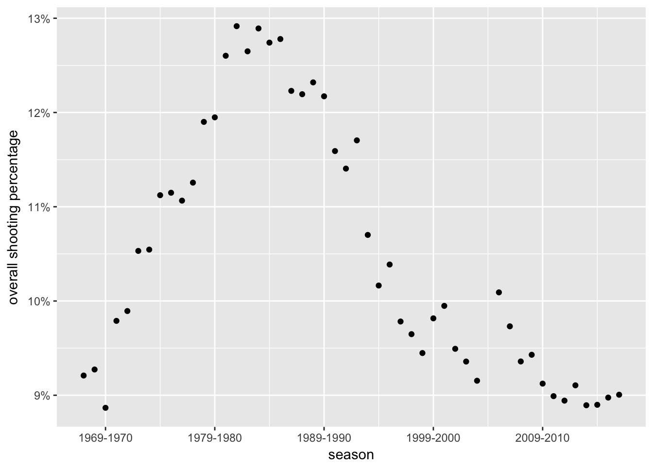
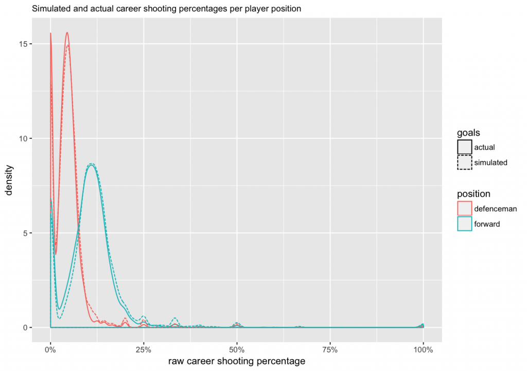
Now that we have fitted our model, we would like to evaluate if it makes sense. One way to approach this is with a simulation. We can use the model (players’ skills, and seasons’ difficulties) and the historical number of shots on goal to generated a simulated set of goals scored. Then we can visualize the actual and simulated numbers, and see if they behave similarly. Let’s start with the same density plot we used above to evaluate typical raw career shooting percentages for forwards and defencemen. Actual results are shown with a solid line, and the simulation results with a dashed line. Ideally, they should be close to each other.

We will also re-create the plot we used above for overall league shooting percentages per season. Again, ideally the actual and simulated data points should be close to each other.

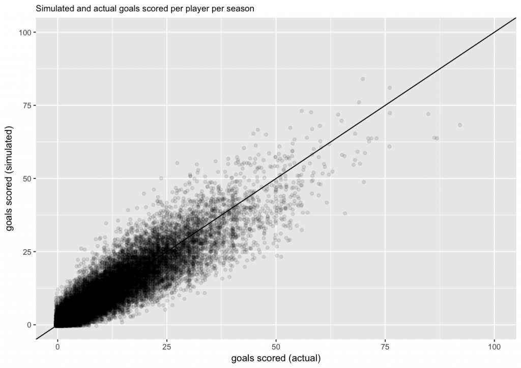
And finally, we will make a scatter plot of actual and simulated goals scored per player per season. Ideally, the cloud of points should be symmetric around the diagonal line.

In the density plot, the fit looks good for defensemen, but for forwards the model seems to slightly overestimate the number of forwards with an average raw shooting percentage (around 11%), and underestimate the number of forwards with low raw shooting percentages. Otherwise the fits seem to be reasonable close. So, let’s look at the results.

Results

When we fit the model, two things happen to the original raw career shooting percentages. First, they are shrunk towards the averages defined separately for forwards or defencemen. Second, they are adjusted for the seasonal difficulty. For players with careers during the “easier” seasons, such as in the 1980s, this will reduce their estimated skill. And for players who played during seasons with a higher estimated difficulty, their skill values will see an increase.

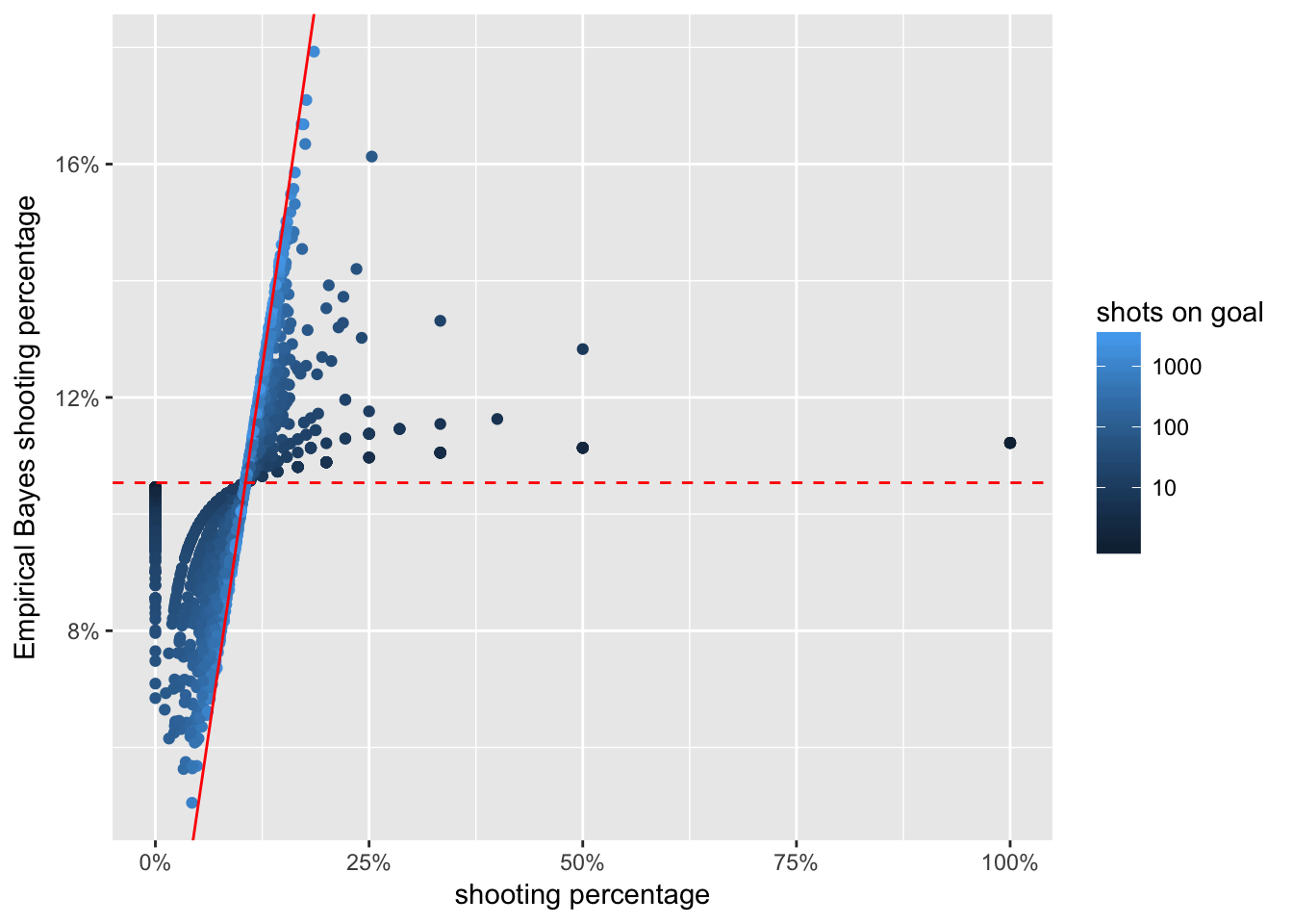
The resulting values, players’ skills, are visualized here together with their raw career shooting percentages.

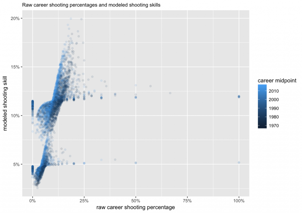
We can see that among the raw shooting percentages on the x-axis, there are extreme values, such as 0%, 100%, 50%, etc. But on the modeled skill on the y-axis, they have been shrunk to all be between about 2% and 20%. Also visible are the two separate clusters for forwards (around 11%–12%), and defencemen (4%–5%). The shades of blue show how the same raw career shooting percentage results in a higher estimated skill for more recent players compared to the 1970s and 80s.

Finally, below are tables of the top 10 forwards and defencemen, ranked according to their modeled shooting skills.

player position career shots goals raw model
1 Alex Tanguay forward 1999–2016 1,525 283 18.56% 19.96%
2 Craig Simpson forward 1985–1995 1,044 247 23.66% 19.91%
3 Steven Stamkos forward 2008– 1,876 321 17.11% 19.32%
4 Andrew Brunette forward 1995–2012 1,516 268 17.68% 18.92%
5 Sergei Makarov forward 1989–1997 610 134 21.97% 18.66%
6 John Bucyk forward 1967–1978 1,723 329 19.09% 18.39%
7 Mark Parrish forward 1998–2011 1,247 216 17.32% 18.17%
8 Charlie Simmer forward 1974–1988 1,531 342 22.34% 18.14%
9 Gary Roberts forward 1986–2009 2,374 438 18.45% 17.92%
10 Ray Ferraro forward 1984–2002 2,164 408 18.85% 17.68%
player position career shots goals raw model
1 Sandis Ozolinsh defenceman 1992–2008 1,771 167 9.43% 9.55%
2 Shea Weber defenceman 2005– 2,235 183 8.19% 9.24%
3 Mike Green defenceman 2005– 1,618 134 8.28% 9.15%
4 Lubomir Visnovsky defenceman 2000–2015 1,532 128 8.36% 9.00%
5 Bobby Orr defenceman 1967–1979 2,795 257 9.19% 8.91%
6 Marc-Andre Bergeron defenceman 2002–2013 951 82 8.62% 8.88%
7 Oliver Ekman-Larsson defenceman 2010– 1,134 88 7.76% 8.53%
8 Nick Holden defenceman 2010– 350 32 9.14% 8.45%
9 Tyler Myers defenceman 2009– 737 59 8.01% 8.45%
10 Mark Giordano defenceman 2005– 1,295 99 7.64% 8.44%

Craig Simpson holds the official record for best career shooting percentage, which only counts players with at least 800 shots on goal, with 23.66%. But here he has lost the number one spot to Alex Tanguay, who originally ranked 22nd. Their modeled shooting skills are 19.91% vs. 19.96%. This is is due to the fact that Simpson’s career was in 1985–1995, which according to the model was a less difficult era for goal scoring than Tanguay’s 1999–2016.

There are many such differences between the official career shooting percentage ranking and our modeled one. They can be explored from the full table with 5,574 players. It is by no means the right ranking; it is simply a plausible one given the model and assumptions described above. But compared to the official ranking for career shooting percentage, it does have two benefits. First, it does not omit players with less than 800 career shots on goal. And second, it provides one way to gauge changes in gameplay, and thus facilitate comparisons between players whose careers do not overlap. So, while the model’s assumptions are not exactly realistic (an innate shooting skill that stays constant for the duration of a player’s career), the results can be a useful complement to the official career shooting percentage statistics in some situations.


  1. Centers and left/right wingers are all counted simply as “forwards”. This is because multiple players have played both as centers and wingers. The small number who have played both as forwards and defencemen were excluded from the analysis.

Posted in R, R-bloggers, sports | Comments Off on Ranking NHL’s best shooters with Bayesian multilevel modeling

Convenient plotting of distribution shapes in R

I needed to compare the shapes of a few distributions, and therefore wanted an easy way to plot them in R. For example, the standard normal can be plotted quickly enough with curve(dnorm(x, mean=0, sd=1), from=-3, to=3). But when comparing multiple ones, there could be something a bit more handy in terms of keeping track of parameter values for each. So, I ended up writing a little convenience function for that purpose.

As an example, a few beta distributions can be compared with:

plot_dist(dbeta, c(shape1=2, shape2=8))
plot_dist(dbeta, c(shape1=2, shape2=5), col="red", add=TRUE)
plot_dist(dbeta, c(shape1=2, shape2=3), col="blue", add=TRUE)
plot_dist(dbeta, c(shape1=2, shape2=2), col="darkgreen", add=TRUE)

plot_dist

The code for plot_dist() is in this gist.

Posted in R | Comments Off on Convenient plotting of distribution shapes in R

How good is Patrik Laine’s shot?

Patrik Laine is playing his first season in the NHL and currently leads the league in scoring with 12 goals. With 51 shots on goal, his shooting percentage is 23.5 %. How does this number compare to great goal scores over the years? I downloaded NHL player statistics for each season from 1967–1968 onwards, which was the first year the number of shots was recorded. I then calculated career summaries for each player. But if we simply look for players with the highest shooting percentages, the first 12 all scored one goal with just one shot. Obviously these are not the best shooters, just some random flukes. In its official leaderboard for all-time career shooting percentage (S%), the NHL only counts players with at least 800 shots. This is what the top 10 looks like:

Name Pos GP G A PTS S S%
1 Craig Simpson LW 634 247 250 497 1,044 23.7
2 Charlie Simmer LW 712 342 369 711 1,531 22.3
3 Paul MacLean RW 719 324 349 673 1,513 21.4
4 Mike Bossy RW 752 573 553 1,126 2,705 21.2
5 Yvon Lambert LW 683 206 273 479 1,038 19.8
6 Rick Middleton RW 1,005 448 540 988 2,275 19.7
7 Blaine Stoughton RW 526 258 191 449 1,322 19.5
8 Darryl Sutter LW 406 161 118 279 829 19.4
9 Rob Brown RW 543 190 248 438 979 19.4
10 Mike Ridley C 866 292 466 758 1,513 19.3

Requiring a minimum number of shots (or goals) does get rid of the flukes, but how can you compare a rookie player? What kind of method could be used to take the scarcity of evidence into account, until the player catches up with the threshold? David Robinson has written a terrific series of articles for situations like this, using baseball statistics as an example. I’ll follow one of his tutorials and use empirical Bayes estimation to obtain a more reliable picture. In short, we’ll first use all players’ data to obtain an estimate for a beta prior, and then use each player’s own data to update the prior based on individual evidence. Put another way, we start by assuming everyone is average, and if and only if they show more and more evidence to the contrary, we start to gradually consider them as special. For a more much better description, please see the original blog post. All R code is also adapted from that post.

Before we get to estimation of the beta prior, let’s first check if we should use all of the available data or only a subset. Since in this case we are estimating only one prior, we would like all players to come from a single distribution. As the gameplay has surely changed a bit over the years, let’s look at the overall shooting percentages over the 49 seasons. Also, since defensemen normally play futher away from the opponent’s net than forwards, player position is likely to have an effect as well. Let’s look at shooting percentages separately for each position (excluding players with less than ten goals).

unnamed-chunk-3-1

unnamed-chunk-4-1

As we can see, shooting percentages used to be much higher around the 1980s. For this simple analysis, I’ll only include data from season 1996–1997 onwards. I’ll also leave out the defensemen, as they tend to have lower shooting percentages. (I hope to write follow-ups posts later with all of the data included and handled properly, either using some of the other approaches David has described for empirical Bayes, with a standard Bayesian analysis, or maybe even both.)

Overall, the average shooting percentage for all forwards over the last 20 seasons is 11.0 %. Next, let’s estimate a beta prior from the data and see how it fits:

unnamed-chunk-8-1

Shooting percentages can now be adjusted using this prior. This will shrink individual players’ estimates towards the horizontal dashed line. The more evidence there is for an individual (the brighter the blue dot), the more we trust it. The darker dots show a lot of shrinkage, whereas the light ones are much closer to the diagonal red line, which marks the case of no shrinkage at all.

unnamed-chunk-10-1

Finally, let’s look at the ranking (from season 1996–1997 onwards) for shooting percentage estimated with empirical Bayes (EB). Patrik Laine currently sits at number 40, and only time will tell where he moves on that list. But what we do know today, is that he is one of only four 18-year-olds to score two hat tricks in the NHL (others being Jack Hamilton, Dale Hawerchuk, and Trevor Linden), and he still has the rest of the regular season to hunt for a third one before his 19th birthday on April 19th, 2017.

Name Pos GP G A PTS S S% EB
1 Alex Tanguay LW 1,088 283 580 863 1,525 18.6 17.9
2 Andrew Brunette LW 1,099 265 462 727 1,500 17.7 17.1
3 Steven Stamkos C 586 321 261 582 1,876 17.1 16.7
4 Mark Parrish RW 722 216 171 387 1,247 17.3 16.7
5 Dmitri Khristich C 420 111 171 282 633 17.5 16.3
6 Mike Ridley C 75 20 32 52 79 25.3 16.1
7 Tomas Holmstrom LW 1,026 243 287 530 1,489 16.3 15.9
8 Gary Roberts LW 639 181 224 405 1,120 16.2 15.6
9 Brenden Morrow LW 991 265 310 575 1,670 15.9 15.5
10 Jan Hrdina C 513 101 196 297 619 16.3 15.3
11 Jason Allison C 519 152 326 478 962 15.8 15.2
12 Ziggy Palffy RW 565 276 333 609 1,799 15.3 15.0
13 John LeClair LW 624 281 274 555 1,833 15.3 15.0
14 Alexander Mogilny RW 530 207 274 481 1,341 15.4 15.0
15 Pierre Turgeon C 622 197 351 548 1,285 15.3 14.9
16 Tyler Bozak C 451 112 169 281 717 15.6 14.8
17 Sergei Kostitsyn LW 353 67 109 176 414 16.2 14.8
18 Joe Nieuwendyk C 628 236 242 478 1,555 15.2 14.8
19 Anson Carter RW 674 202 219 421 1,331 15.2 14.8
20 Tony Hrkac C 425 70 105 175 438 16.0 14.7
21 Mark Messier C 555 155 264 419 1,015 15.3 14.7
22 Yanic Perreault C 742 217 237 454 1,436 15.1 14.7
23 Adam Deadmarsh RW 441 154 154 308 1,010 15.2 14.7
24 Adam Henrique C 364 101 109 210 650 15.5 14.7
25 Teemu Selanne RW 1,192 521 594 1,115 3,528 14.8 14.6
26 Jonathan Toews C 662 255 321 576 1,710 14.9 14.6
27 Jiri Hudler C 680 161 256 417 1,068 15.1 14.6
28 Paul Byron C 217 34 43 77 198 17.2 14.5
29 Brad Marchand C 470 158 147 305 1,057 14.9 14.5
30 Sidney Crosby C 716 348 603 951 2,376 14.6 14.4
31 Mike Sillinger C 831 210 234 444 1,420 14.8 14.4
32 Keith Tkachuk LW 893 394 382 776 2,713 14.5 14.3
33 Peter Forsberg C 579 204 515 719 1,390 14.7 14.3
34 Milan Lucic LW 664 164 242 406 1,111 14.8 14.3
35 Dany Heatley RW 869 372 419 791 2,565 14.5 14.3
36 David Desharnais C 420 78 168 246 511 15.3 14.3
37 Martin Straka LW 714 206 370 576 1,408 14.6 14.3
38 Thomas Vanek LW 824 320 337 657 2,213 14.5 14.2
39 Stephane Matteau LW 471 75 88 163 493 15.2 14.2
40 Patrik Laine RW 18 12 5 17 51 23.5 14.2
Posted in R, sports | Comments Off on How good is Patrik Laine’s shot?

Boat trips and weather observations

Another boating season is over, so I updated the shiny app of my boat trips with another year’s worth of Moves app data.

I also added weather and wave observations from the API of the Finnish Meteorological Institute. Clicking on a track brings up these details, provided the closest weather stations and wave buoys are within 30 nautical miles from the track. They are therefore only approximations, and can vary from the conditions actually experienced on the boat, depending on its location relative to the stations/buoys and nearby islands.

It should also be noted that the tracking accuracy of Moves is lower than that of proper chart plotters, which is only natural considering battery consumption. There are also clear errors when close to shore, as Moves has a tendency to place the location on known roads. Tracks and all values should therefore be taken with a grain of salt.

screen-shot-2016-10-20-at-19-53-39

The source code can be found on GitHub, and the app itself is here.

Posted in R, sailing, transportation | Comments Off on Boat trips and weather observations

Finland’s dependency ratio and pension contributions

In March, I made simple visualizations of Finland’s population structure and statutory pension contributions. I also made a third one, combining the two topics, but never posted it. Here it is.

finland-dependency-ratio

Shown in white is the aged dependency ratio, which is the proportion of people aged 65 and over, compared to those between 15 and 64. A solid line shows historical data, and future predictions are shown with a dashed one. The blue line shows statutory pension contributions as percent of GDP.

I agree with the former MP Kimmo Kiljunen in that the capital amassed in pension funds should be used. But I disagree with him when he says that they should be used to increase pensions. Instead, they should be used to keep pension contributions from skyrocketing along with the dependency ratio.

That’s the very reason why these funds were accumulated in the first place.

The code to generate the figure above is in this gist.

Posted in R | Comments Off on Finland’s dependency ratio and pension contributions

Finland’s mandatory pension contributions

A couple of weeks ago, I made an animated visualization of the population structure of Finland. Here’s another plot exploring demographic changes, this time coupled with the economy.

Finland has a defined-benefit and earnings-related statutory pension system. Employers are required by law to pay pension contributions of 24.0 % on top of an employee’s gross salary. In addition, the employee is required to pay a contribution of 5.7 %, or if they are 53 years or older, 7.2 %. These contributions are used to pay out the current pension liabilities. (The system is partly funded, but currently more is paid out than collected.)

Here’s a plot of the total contributions as a percentage of the gross domestic product (GDP).

finland-pension-contributions

The R code to produce the plot is in this gist.

Posted in R | Comments Off on Finland’s mandatory pension contributions

Population Structure of Finland

Inspired by the blog post Japan’s aging population, animated with R by David Smith and the population pyramid plot by Kyle Walker, I figured I’d try the same for Finland.

I used the pxweb package (by Måns Magnusson, Love Hansson, and Leo Lahti) to pull the corresponding data from Statistics Finland, and plotted it by making some adjustments to Kyle’s code.

finland-population-structure

The R code to generate the animation is in this gist.

Posted in R | Comments Off on Population Structure of Finland

Snowplows of Helsinki

As part of the Helsinki Region Infoshare initiative, the city of Helsinki provides an API that shows the locations, routes, and activities of snowplows that are operated by its service provider Stara.

Using that API, Sampsa Kuronen created Aurat kartalla, which is a beautiful visualization of the real-time data. It allows you to specify a time interval, and shows different activities (snow removal, spreading sand, de-icing with salt, etc) with different colors.

I decided to try my own version with shiny, for a couple of reasons:

  1. In addition to identifying different activities, the API also includes a flag specifying “bicycle and pedestrian lanes”. Aurat kartalla always shows them with the same color, therefore not distinguishing between e.g. spreading sand and de-icing with salt. Although I personally don’t really mind that much, for some cyclists this is important information. Many have suffered flat tires because of the sand, and many feel that the salt rusts their bikes.
  2. Outside bicycle and pedestrian lanes, Aurat kartalla does show the different activities with different colors. But when there are multiple activities performed on the same route, it can be difficult to tell them apart.
  3. I had never created a shiny app that polls an external API and automatically updates its data, so it was simply an interesting experiment.

Here are links to the resulting shiny app and its source code on GitHub.

Screen Shot 2016-02-03 at 14.50.53

As my goal was to provide granular control to really check what activities had been performed along a specific route, at first I included a separate setting to distinguish between streets and bicycle/pedestrian lanes. However, after looking at the results on a couple of snowy days, I noticed that this flag wasn’t really that reliable. Exact same routes were plowed both with and without it.

I can think of two possible explanations. The first one is that the flag really just specifies the equipment used, and some plows are marked for bicycle/pedestrian lanes, while others are not. And that in reality, both can also operate outside these target routes. The second one is that the presence of the flag relies on the plow driver explicitly specifying when they are plowing a bicycle/pedestrian lane, and that this is simply often forgotten (as, to be honest, I would expect to happen in reality).

Therefore, I removed the separation between streets and bicycle/pedestrian lanes, and instead show both at the same time. But the main point is still to be able to unambiguously distinguish between the different activities that have been performed. However, this goal suffers a bit from the fact that the API doesn’t actually contain all of the plows in use, so there is no way to tell for sure whether something has not been performed.

Nevertheless, it was a fun experiment. And in any case, I think Aurat kartalla provides a more beautiful overall visualization of the same data, and with better performance.

Posted in R, transportation, urban | Comments Off on Snowplows of Helsinki

Mapping my boat trips

Now, in the middle of winter and when I’m a feeling bit under the weather, it’s a perfect moment to reminisce about summer and time spent on the Finnish Archipelago Sea. So, I combined tracking data from the Moves app with some shiny and leaflet code to make an interactive map that shows my boat trips from the last two years.

The source code can be found on GitHub, and the app itself is here.

Screen Shot 2016-01-31 at 18.54.20

Zooming in on the tracks brings back memories from all those legs and marinas, of great sailing and even better company. It lets me relive moments like these.

Posted in R, sailing | Comments Off on Mapping my boat trips