I needed to compare the shapes of a few distributions, and therefore wanted an easy way to plot them in R. For example, the standard normal can be plotted quickly enough with curve(dnorm(x, mean=0, sd=1), from=-3, to=3). But when comparing multiple ones, there could be something a bit more handy in terms of keeping track of parameter values for each. So, I ended up writing a little convenience function for that purpose.
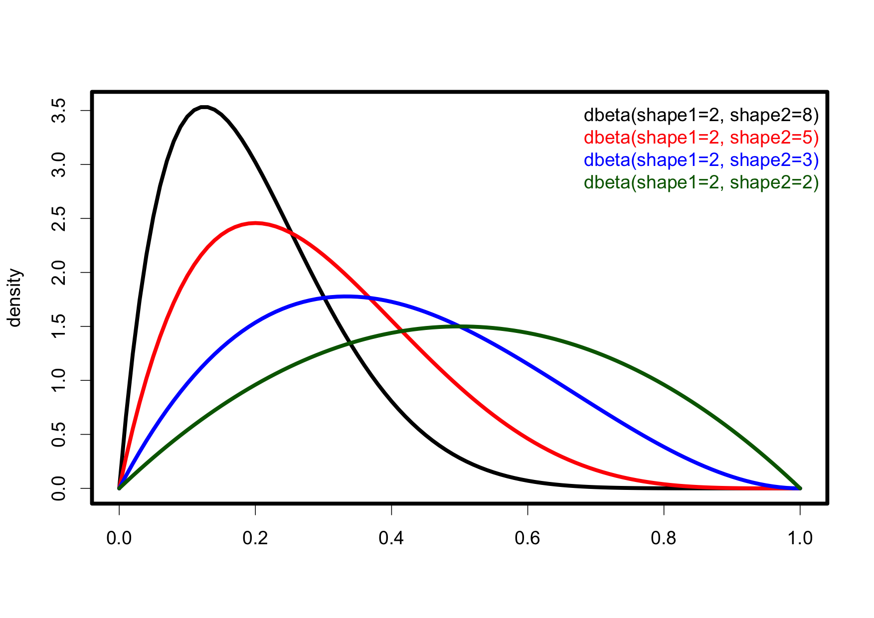
As an example, a few beta distributions can be compared with:
plot_dist(dbeta, c(shape1=2, shape2=8))
plot_dist(dbeta, c(shape1=2, shape2=5), col="red", add=TRUE)
plot_dist(dbeta, c(shape1=2, shape2=3), col="blue", add=TRUE)
plot_dist(dbeta, c(shape1=2, shape2=2), col="darkgreen", add=TRUE)
The code for plot_dist() is in this gist.