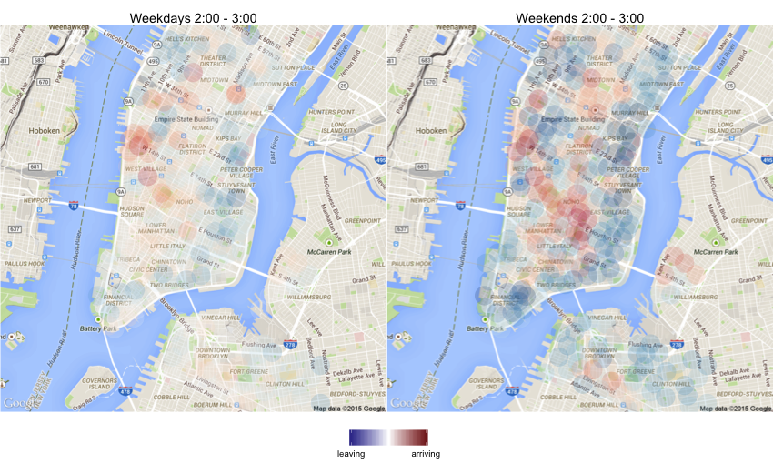
New York City has an excellent bike sharing system called Citi Bikes. When I was at the Recurse Center, I frequently used the bikes for commuting. What was annoying though, was that every now and then all the nearby docks were empty by the time I was leaving. I guess this was because it was mostly a residential area, so in the mornings people would grab the bikes and ride them to work, and in the evenings the bikes would flow back. A business district would naturally see the opposite pattern. (I know the operators rebalance bikes between stations, but I don’t know if this happens intra-day or just to correct slower drift patterns.)
In addition to being a convenient way to move around, another nice thing about the system is that they release their ride data publicly. I decided do a little experiment in R. I downloaded all their data and used dplyr to count the number of bikes arriving to and leaving from each station. I did that for each hour of the day and separately for weekdays and weekends.
In order to visualize the patterns, I plotted them with ggmap and made a little shiny app.
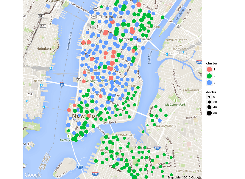
To identify neighborhoods with similar usage patterns, I used K-means clustering and put the results in another shiny app. It also contains a plot of the variance explained for assessing a suitable value for K.
The source code is available on GitHub.