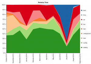
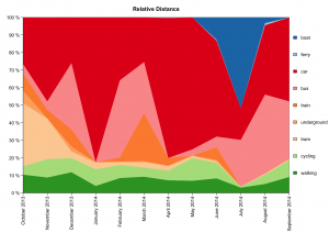
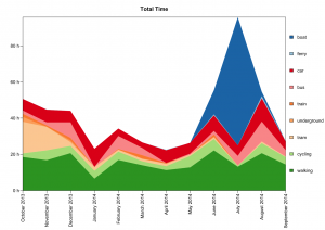
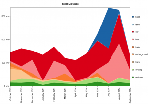
With 12 full months of Moves data, I thought it would be a fun experiment to make some plots. These show how I move around in terms of time spent and distance traveled, both for relative share of each mode of transport, and for the total time or distance. Flying is excluded.


